Announcing the simple-tree-component
Introduction
Over a year ago, a colleague of mine and me were searching for a javascript-component capable for tree-rendering. There were a few must-have aspects we were looking for:
- Zero runtime-dependencies (especially no JQuery)
- Actively maintained
- Framework-agnostic
- Good integration with modern bundlers
These requirements did already reduce the number of possible libraries to a considerable degree. In addition, we had to consider the requirements of our product as well:
- Text-search through tree-nodes
- Mode where the tree is rendered in a container
- Dropdown-mode for single-selection
- Dropdown-mode for multi-selection
Neither did any component meet our requirements, nor did using two libraries for the different use-cases turn out to be sufficient. So we started considering the effort of developing and maintaining our own component with some extras, as TypeScript support. The ” Simple-Tree-Component” was born. The first lockdown-phase of the Covid-pandemic in summer 2020 gave us time to implement the basics.
Let’s have a look at the different features and concepts.
Three modes
As mentioned above, we had to implement different modes for multiple use-cases and ui-scenarios. The simplest mode simply renders the tree in a container:
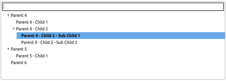
It’s possible to enable multi-selection with Checkboxes if needed. Furthermore, it can be configured whether child-nodes are automatically selected or deselected when a parent-node changes its selection-state.
The second variant we had to get covered, was a single-select dropdown:
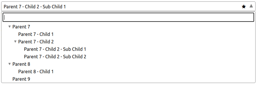
When the dropdown-flyout is closed, only the box itself is displayed in the same way as of native <select> HTML-elements. A function can be defined which is called on each node-selection to customize the text displayed in closed-state. With the Emphasize-feature it is possible to add a custom css-class to the component-box. This, for example, makes it possible to add a icon as “eye-catcher” for the current selection.
Last but not least, the component can handle multi-selections with a dropdown, too. All selected nodes are rendered as pillboxes and can be deselected individually or all at once.
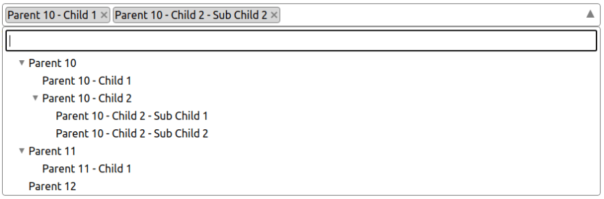
Most of the features mentioned for the “single-selection” mode can be used for “multi-selection” as well.
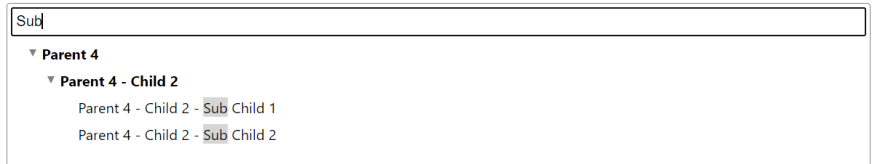
Search and Highlighting
In all mode-variants it is possible to enable the text-search-feature to filter tree-nodes. The chain from a matching child-node to its root-node is always displayed. By default non-matching childs are not displayed when a parent-node matches the search-text but this behaviour can be changed individually. In addition to searching in general, the search-results can be highlighted as well.
Styling
All styles are implemented with SASS to ensure good adaptability. The sass-files are also part of the NPM package.
Data-driven
The main concept for data-handling was using a completely data-driven approach. The reason for it was the necessity of removing and modifying existing tree-nodes and adding new ones when the tree is already rendered. Even though it would be possible to use a DOM-driven approach here, extracting the data-states from the UI and still making it work with any framework at the same time would turn out more difficult.
Type-safety
The whole code is developed in TypeScript with a very strong typing, especially for the public API. This makes development for library-contributors and for developers easier and more efficient.
Browser compatibility
The code is compiled to ES2015 at the moment. This should ensure compability to most modern browsers. However - also due to the lack of cross-browser tests - there is no explicit list of supported browsers or versions. The only thing we can be sure about is, that there will never be support for any Internet Explorer version. :)
Documentation
All features, other aspects and a “Getting started” are also documented. At the Github-Repo you can find a demo-integration with the SPA-Framework ” Aurelia”.
Contributions
As every open-source project, this component is also open for issues, discussions and feature-requests. Do not hesistate to reach out to us. We’re looking forward to your feedback.
Conclusion
There are some new features in development as well as improvements for increasing the stability even more. At the end of this post I want to say “Thank you!” to my colleague Thomas who helped me a lot in creating this library from the first day on. Many thanks!